Sector
Lighting
Role
URL
4liteuk.com
Release Date
2023
Challenge
Bringing Light to Complexity
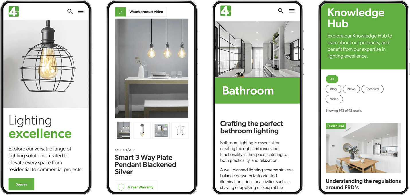
The existing site made it difficult for users to confidently find the right product. There was too much friction between discovering products, understanding technical specs, and getting guidance on what was right for a specific space or project. Internally, 4lite also needed to avoid manual content creation wherever possible and ensure the site remained scalable via PIM integration.


Discovery
Lighting the Way
To better understand how the site could align with user and business goals, I ran a collaborative discovery phase with the client. This included workshops and exercises to clarify the needs of their core audience and to define opportunities for simplifying the experience and highlighting smart lighting features more effectively.
User Personas
To ensure the user remained front and centre throughout the project, I created a persona that captured key traits, goals, and pain points of the core audience. This was informed by stakeholder insights and helped steer design decisions.

How Might We
I facilitated a 'How Might We' session with the client to identify user needs and spark solution-focused thinking. This exercise helped frame early ideas for simplifying tech info, guiding users with contextual content, and making inspiration easier to find.

Approach
Establishing the Structure
I created a clear sitemap and information architecture to support user journeys, from homepage to spaces to product pages. I developed wireframes to test key placements, like product highlights, filtering, and education blocks.


Guiding the Right Choice
The vision was to guide users towards the right product with minimal friction, supporting their project needs without overwhelming them. I focused on surfacing helpful content at just the right moments, and ensured smart features were visible across the experience, not siloed away. Working closely with the development team, I also also aimed to streamline content management by reducing reliance on custom content, while still delivering a rich and educational experience.

High-Fidelity Visuals