2023
Wholesale / Eco
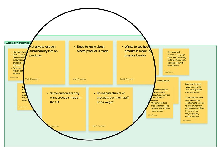
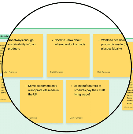
User Research
Interviews
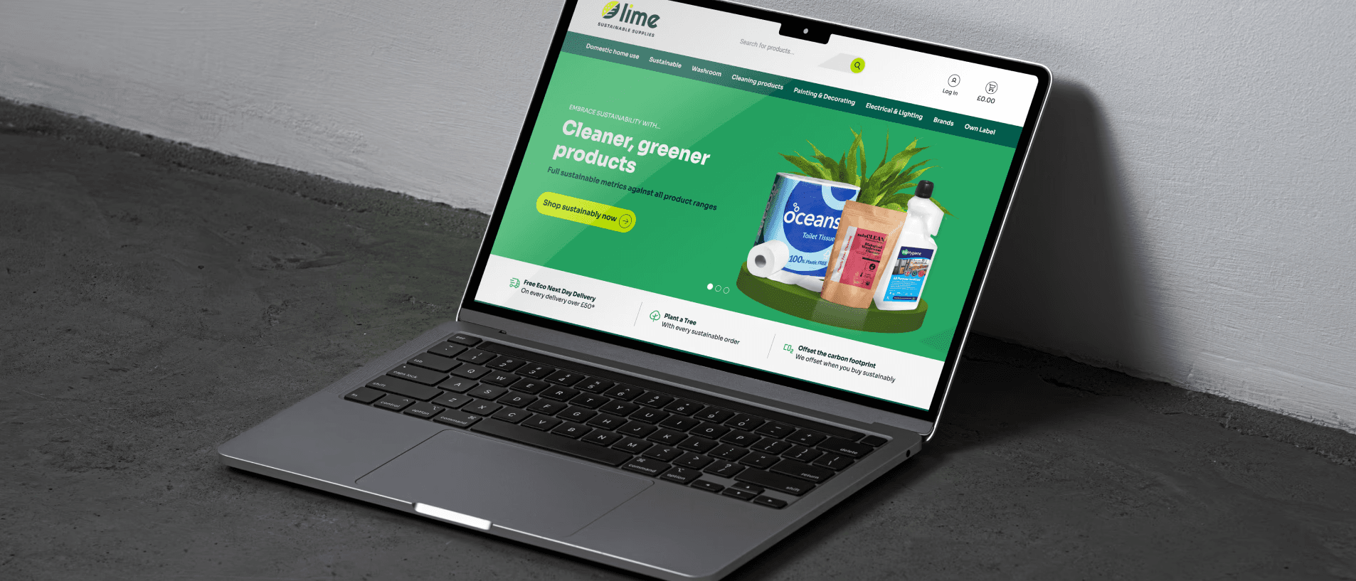
Web Design

Discovery
I analysed competitor sites and found limited clarity around sustainability credentials—highlighting an opportunity for Lime to lead with stronger eco labelling.
I also conducted five customer interviews (business owners and managing directors), which revealed friction in the ordering experience, gaps in product information, and difficulty identifying sustainable options. Customers valued eco-friendly products but lacked the tools and information to confidently choose them.


Insights
I focused on making sustainability easier to understand through clear, visual eco-credentials, helping users identify suitable products quickly.
I also improved day-to-day usability by streamlining stock visibility, reordering, and order tracking—reducing reliance on manual processes.
Throughout, I ensured the experience remained personal, using clear language, intuitive flows, and consistent branding.


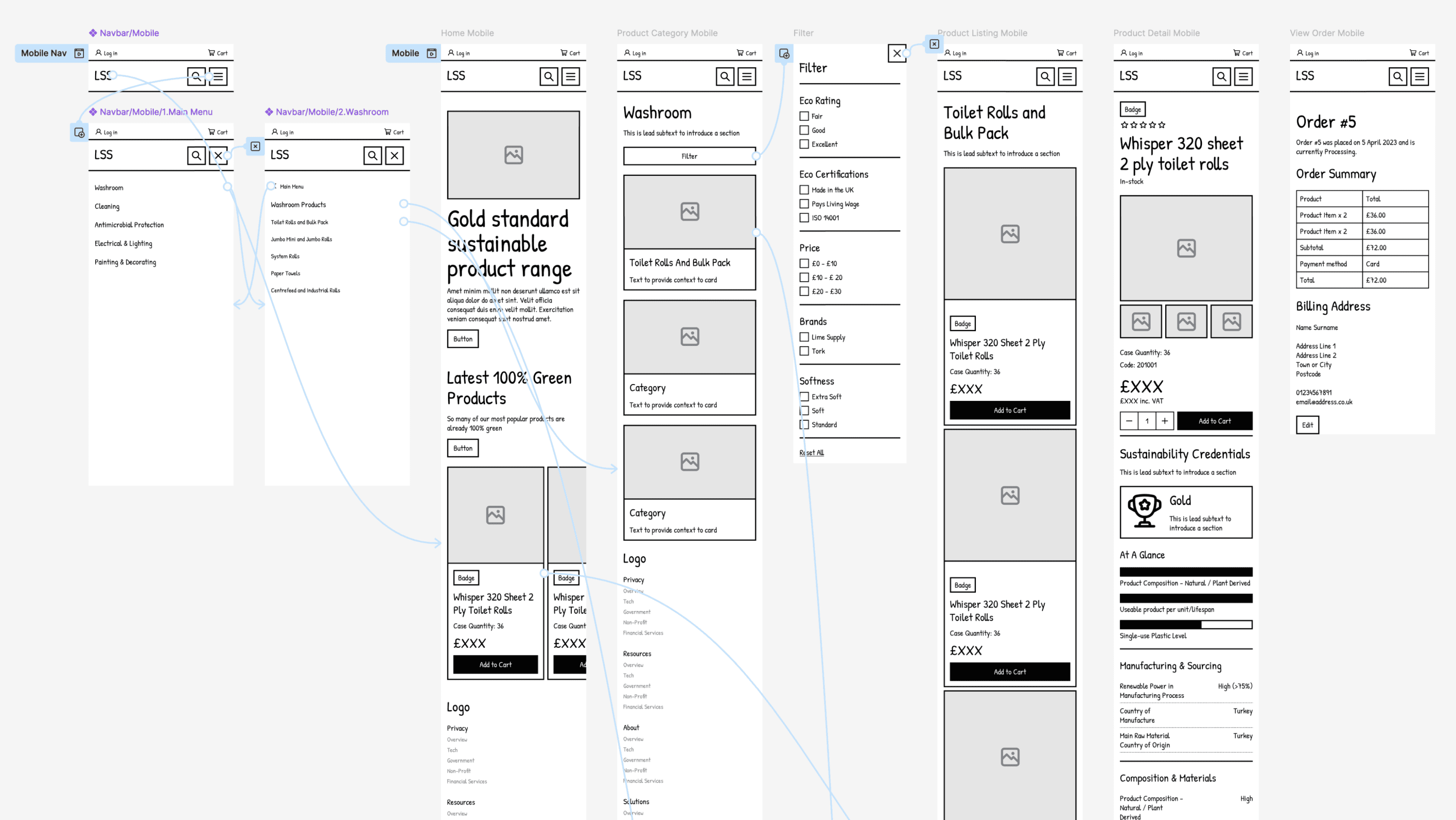
Design
I began with low-fidelity wireframes to quickly explore layout ideas and test assumptions. Prototyping in Figma from the outset let me test real user flow tasks like browsing, filtering by sustainability, and managing orders. This helped identify friction points early and shape an experience that felt intuitive before moving into detailed UI design.
Outcome
I applied the refreshed branding across the interface and integrated it into a flexible Figma design system, ensuring consistency in typography, colour, and components while making it easy for the team to scale and reuse elements.


